Talking at cross-purposes about income inequality
Andrew Coyne’s column arguing that income inequality has stopped getting worse drew a sharply-worded rebuke from Miles Corak and this response from Armine Yalnizyan. To a very great extent, these and other participants in the debate about what is happening to income inequality and what can and should be done about it are often arguing about different things.
Share
Andrew Coyne’s column arguing that income inequality has stopped getting worse drew a sharply-worded rebuke from Miles Corak and this response from Armine Yalnizyan. To a very great extent, these and other participants in the debate about what is happening to income inequality and what can and should be done about it are often arguing about different things.
Any attempt to summarise the distribution of anything with a single statistic is fraught with peril. Many (most?) readers may be familiar with measures such as the mean, the median and the mode. But even though these statistics are all designed as measures of what statisticians call ‘central tendency’, they produce different numbers when applied to real-world data.
Things get even more murky when it comes to measures of dispersion. The gini coefficient is widely used, for reasons that are best described as circular: everyone uses the gini because everyone else uses the gini. But the gini coefficient is only one number, and it can’t hope to capture all the information required to describe the shape of the entire income distribution. In particular, the gini coefficient doesn’t do a good job of capturing changes in the tails of the distribution.
Framing the debate in terms of only one dimension – ‘inequality’ – can lead to problems. I once made the following distinction:
- First-order inequality is visible in standard measures such the gini coefficient, and shows up as an increase in the gap between average and median incomes. If income growth is concentrated in the top half of the income distribution, average incomes will increase, but median incomes will remain unchanged.
- Top-end inequality refers to the share of income that goes to those whose income puts them above the 99th percentile and beyond.
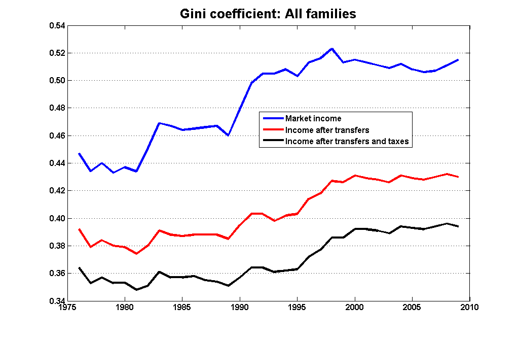
Much of Coyne’s argument was based on what has been happening to the gini coefficient, which leveled off in the mid-1990s:
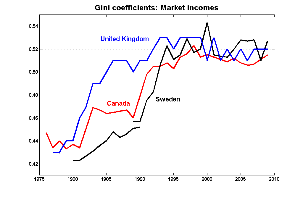
This pattern is not unique to Canada:
But the patterns in ‘top-end’ inequality are quite different. Here is a graph from Mike Veall’s survey – the one I summarised here – on trends in the shares of income going to the top end of the income distribution:
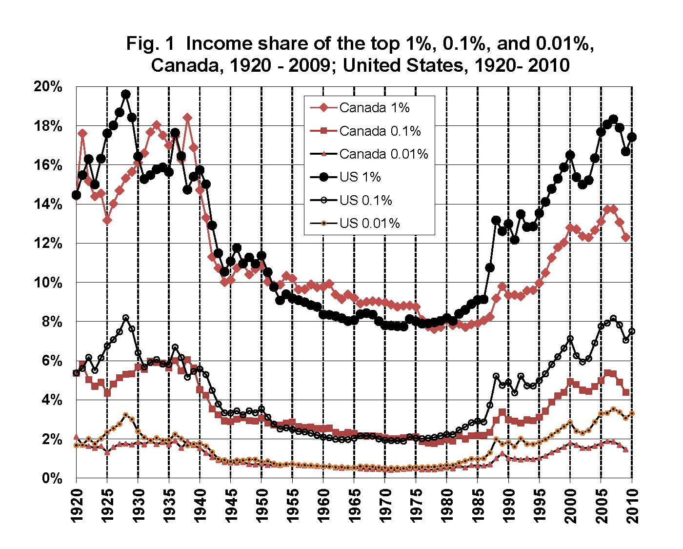
It’s worth noting that when we talk about the top 1% (or the 0.1% or the 0.01%) in Canada and the US, we aren’t necessarily talking about the same sorts of people. The incomes and the income shares in the Canadian top end are significantly smaller that their counterparts in the US:
| Threshold income | Income share | Average income | ||||
| Fractile | Canada | US | Canada | US | Canada | US |
| Top 10% | 81,600 | 107,100 | 40.8 | 45.5 | 145,000 | 222,100 |
| Top 5% | 105,900 | 146,900 | 27.4 | 32.8 | 197,900 | 320,500 |
| Top 1% | 206,900 | 327,600 | 12.3 | 16.7 | 444,800 | 814,800 |
| Top 0.1% | 705,700 | 1,236,000 | 4.4 | 7.0 | 1,581,300 | 3,438,600 |
| Top 0.01% | 2,694,600 | 5,481,100 | 1.5 | 3.1 | 5,284,000 | 14,972,900 |
Coyne notes that the share going to the top 1% in Canada in 2009 was about what it was in 1998. But the recent reduction in the top-end share was driven by the recession, and the 2010 rebound in the US is likely to manifest itself here when the 2010 data become available in Canada. It seems too early to declare the sort of plateau we see with the gini coefficients.
Either way, it’s important to distinguish changes from levels. Even if inequality – measured in either dimension – is no longer getting worse, the point remains that all measures of inequality are higher than what they were 20 years ago.
As to what can and should be done about it, well, I’ll get to that in another post.