The case of the shrinking productivity gap
Paul Boothe and Mikayla Johnson take on an exercise in statistical sleuthing around the productivity gap.
Artiga Photo / Corbis
Share
“There are three kinds of lies,” Benjamin Disraeli is reputed to have said, “lies, damned lies, and statistics.” Not much has changed since Disraeli’s time. Many of the statistics used in policy debates measure things that can’t actually be observed in the real world. The assumptions used in their construction can make a significant difference in how they are interpreted.
An excellent illustration is provided by Canada’s well-known productivity problem. It’s hard to read a business article or think-tank commentary these days that does not bemoan Canada’s lagging productivity growth. Commentators predict dire consequences if Canadian firms do not raise their game by becoming more innovative or fostering a more “entrepreneurial culture.”
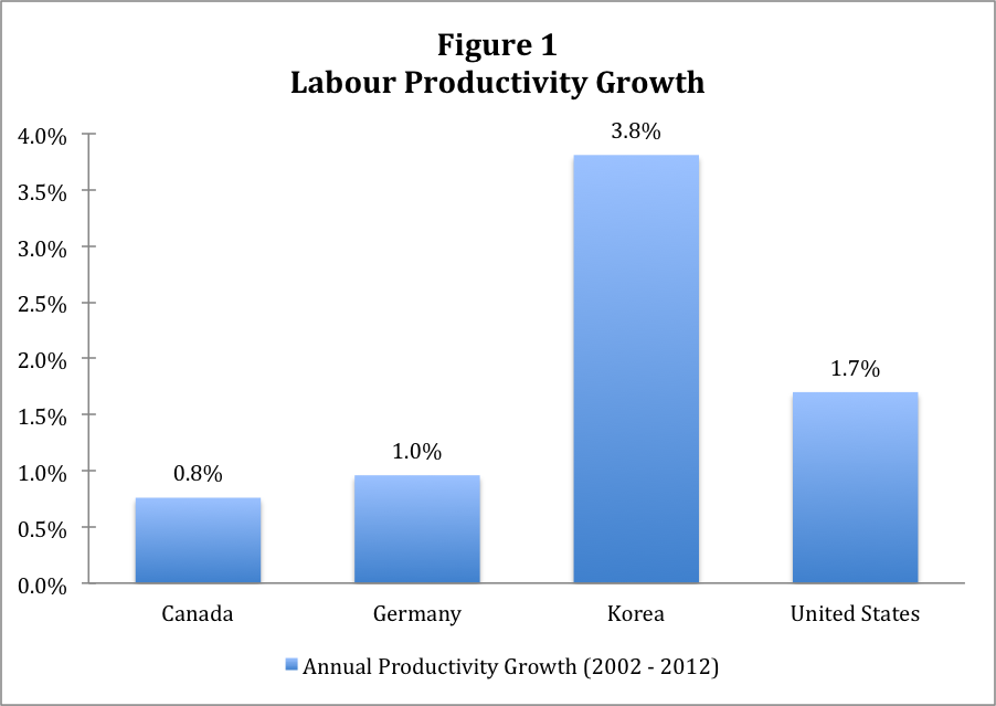
Usually, these warnings are accompanied by charts, such as Figure 1, showing productivity growth for selected countries, with Canada at the bottom of the pack. Looking at the past decade using OECD data ending in 2012, we see that for the four countries selected, Korea is the superstar, with annual labour productivity growth of 3.8 per cent, followed by the U.S. at a strong 1.7 per cent, with Germany and Canada standing at 1.0 per cent and 0.8 per cent, respectively.

Source: OECD.Stat Dataset: Level of GDP per capita and productivity + author calculations.
But what does this chart actually tell us? It turns out, much less than the whole story. To understand the whole story, we need to look behind the curtain at how labour productivity statistics are actually calculated. In principle, labour productivity is simply output produced per hour worked. If there were only one kind of output, say, hockey sticks, then labour productivity would be easy to measure: Divide the annual number of hockey sticks produced in a country by the number of hours worked to produce them. A country that used sophisticated machinery to mass-produce hockey sticks might have higher labour productivity than a country where hockey sticks were hand-carved.
The actual measurement of labour productivity is complicated by a number of factors. Countries produce a number of different products and services and in varying proportions. Thus, we cannot count the number of products, but, rather, must measure their value in the local currency. To compare productivity across countries, the local currency value must be converted to a common currency using an exchange rate. The choice of exchange rate used will turn out to be crucial.
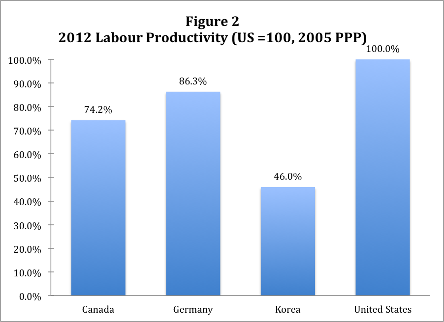
It is also critical to recognize that the statistics presented in Figure 1 describe the growth rate of productivity rather than its level. However, it is the level of labour productivity rather than its growth rate that determines the prosperity and overall competitiveness of a country. When we compare the levels of labour productivity using the same underlying OECD data, as in Figure 2, a different picture emerges.

Source: OECD.Stat Dataset: Level of GDP per capita and productivity, GDP per hour worked using USD constant prices, 2005 PPP exchange rates + author calculations.
Assigning the U.S. a value of 100 to aid comparisons, we see that superstar Korea goes from first to last, almost 54 percentage points below first-place U.S., and badly trailing Germany and Canada. This should give Canadians some pause before they become totally entranced by Korea’s impressive economic performance. We still would not want to match their standard of living or level of labour productivity.
However, before we get too comfortable, a large gap in productivity levels remains between Canada and the U.S. and, to a lesser extent, Germany. This is the second gap that commentators often point to when decrying Canada’s poor productivity performance. As we see, Canada is more than 25 percentage points below the U.S. and 12 percentage points below Germany.
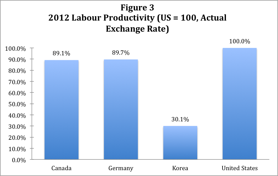
But further investigation should give us pause before we accept even these statistics at face value. The exchange rate used to convert local currencies to U.S. dollars is not the actual exchange rate, but the purchasing power parity (PPP) rate, i.e., an artificial exchange rate that seeks to equalize prices across countries. Again, important assumptions have to be made to calculate the PPP exchange rate. If we use the actual 2012 exchange rate instead of the 2005 PPP rate used by the OECD (for Canada, 100 US cents per dollar rather than 82.6 cents), the labour productivity levels are described by the statistics presented in Figure 3.

Source: OECD.Stat Dataset 1 (GDP) and 4 (PPP and Exchange Rates): GDP per hour worked using USD constant prices, 2012 actual exchange rates + author calculations.
The effect of using actual exchange rates rather than 2005 PPP rates is to shrink Canada’s labour productivity gap with the U.S. to 11 percentage points from 25. The gap between Canada and Germany shrinks from 12 percentage points to about 0.6. The Korean gap with the U.S. grows from about 54 percentage points to 70.
What lessons can we draw from this exercise in statistical sleuthing? Our detective work illustrates the importance of understanding what underlies statistics (including these ones) used to support policy discussions. Many economic statistics are based on assumptions that can have a significant effect on how they are interpreted.
Should we forget about our productivity gap? The short answer is no. Even an 11 percentage point gap with a major competitor is a cause for concern, and if growth rates continue to diverge, the gap will widen over time. However, it’s not time to panic or spend billions of additional dollars on the problem. A careful look at the statistics suggests we may be doing better than we thought.
Paul Boothe is Professor and Director of the Lawrence National Centre for Policy and Management at Western’s Ivey Business School. Mikayla Johnson is a Lawrence Centre Research Assistant and student at Ivey.