What new job numbers tell us about Canada’s economy in 2015
About the best thing that can be said about Canada’s job numbers over the last year is that they could have been worse

THE CANADIAN PRESS/Sean Kilpatrick
Share

Let’s start with the good news: Canada’s job numbers for December could have been a whole lot worse. December saw a renewed collapse in oil prices. There were large-scale layoffs in the Alberta oil patch. And it was a month that saw continued fears over a global recession, with worries over slowdowns in both China and the U.S.
So when Statistics Canada reported the country added 23,000 new jobs, beating forecasts by economists of an 8,000-jobs gain, there was a slight sigh of relief. Slight, because below the top line number, Canada’s job market is still a mess. As Andrew Grantham, an economist with CIBC observed in a report, “December’s jobs report was all quantity but with little quality.”
Here are seven charts to help explain what happened.
1. Canada’s underperforming job market, still underperforming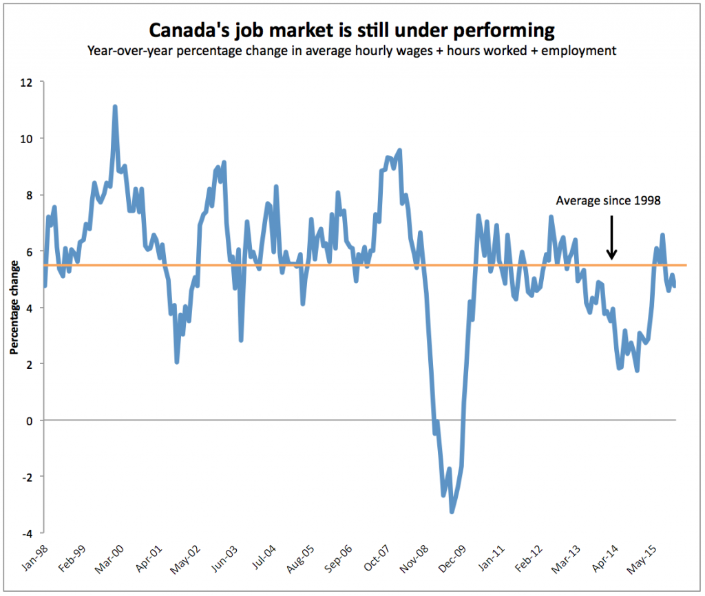
This chart measures Canada’s labour market, and we first wrote about it a little over a year ago, noting that it showed the job market couldn’t get off the ground. It tallies up the percentage change in employment, hourly wages and hours worked. After a brief recovery that lasted throughout the recession of early 2015, the trend has reverted back to disappointing.
2. Only four provinces registered job gains in 2015
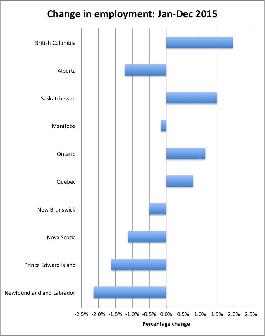
Given the swings in the job market month-to-month, it’s best to take a longer-term view, and in 2015 British Columbia was far and away Canada’s best engine for job growth. Ontario added more jobs (79,000 compared to 45,000 for B.C.) but Ontario’s population is three times larger, which makes B.C. performance all the more impressive. But with only four provinces registering employment growth last year, it’s no wonder Canada’s economy is so weak.
3. Alberta’s unemployment rate—ugly, but stable in December
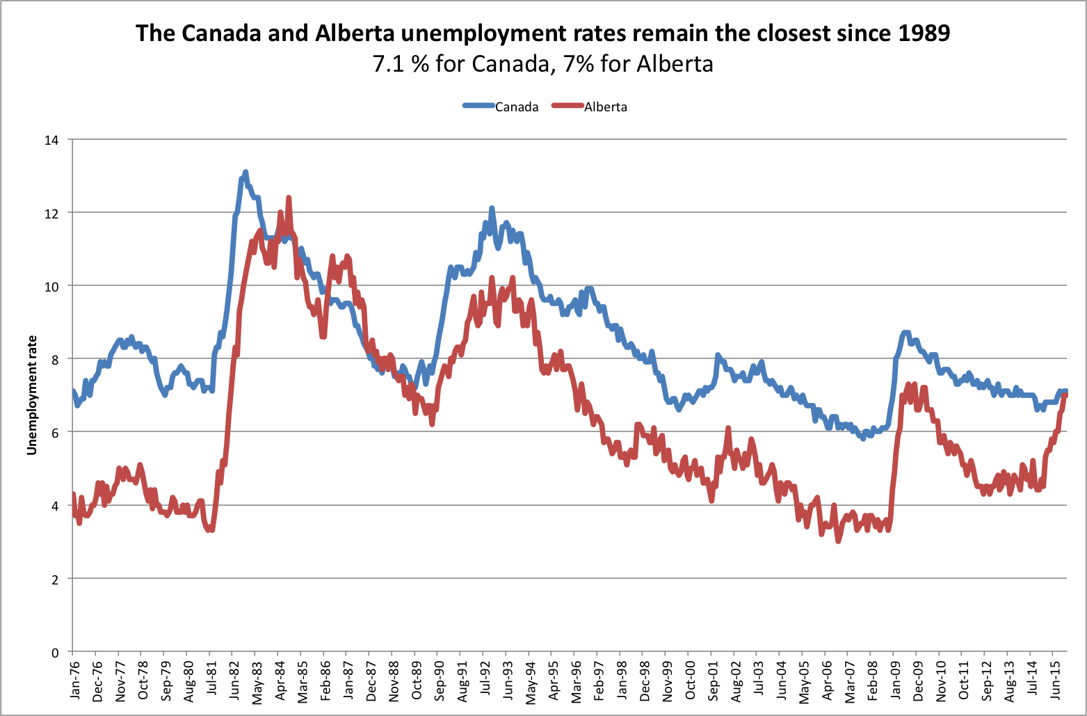 As Jason Markusoff noted last month, Alberta’s unemployment rate in November was virtually on par with the national rate. That remains so, with neither measure changing. When these lines do eventually cross, however, it will be a dark moment for a province that has dramatically outperformed the rest of the country for decades.
4. The employment rate is back to its Great Recession low
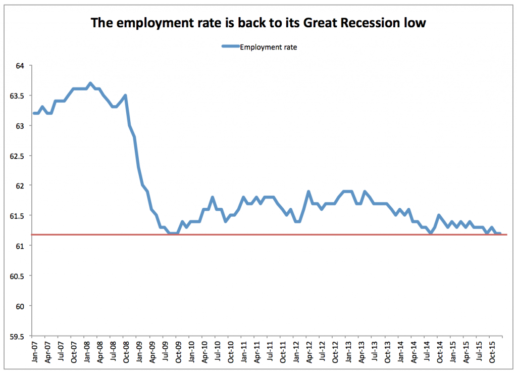
The unemployment rate gets all the attention, the employment rate is perhaps a better measure of the overall health of the labour market. The employment rate measures the number of people with jobs as a share of the total working-age population, while the unemployment rate only captures those who are in the labour force and available to work. December saw Canada’s employment rate once again fall to its lowest point since the Great Recession, a level that it’s been skimming along at for two years.
5. Quantity over quality
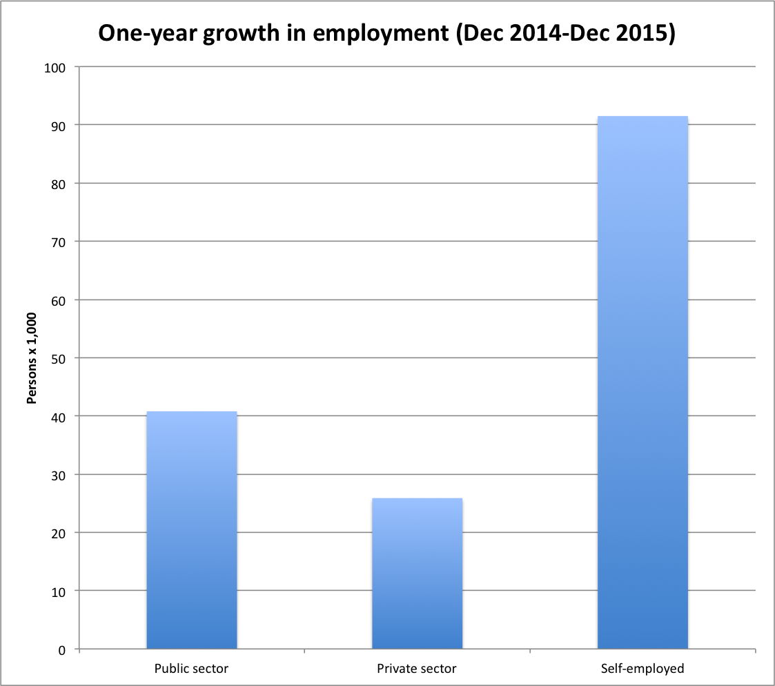
Between December 2014 and December 2015, the job market relied heavily on self-employment for job gains. Were those people who chose to strike out on their own and start their own small businesses? Or were they people who, unable to secure work, joined the freelance economy? Meanwhile, the private sector was the laggard, generating fewer jobs than the public sector over that time period.
6. Alberta’s new job engine: government
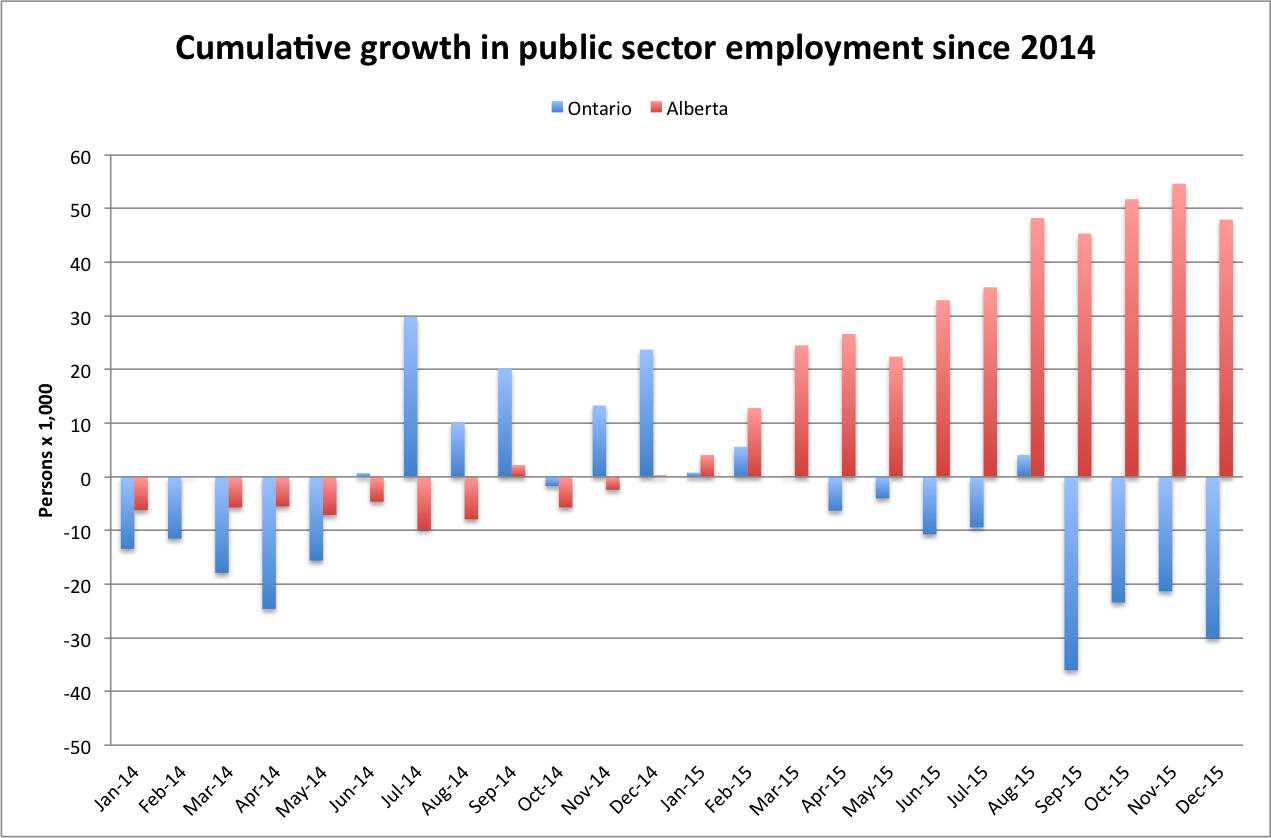
The job market would be a whole lot worse in Alberta were it not for public sector hiring, particularly in education and health. The above chart shows the cumulative change in public sector employment in Ontario and Alberta since the start of January 2014. Meanwhile, Ontario—the economic yin to Alberta’s yang—has seen the reverse take place. As its economy has benefited from the lower dollar, public sector employment has declined and the private sector has done more of the lifting.
7. Worker absenteeism in the public sector is on the rise
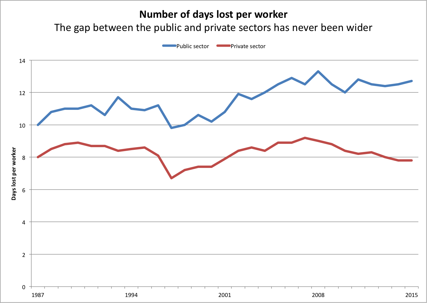
This last chart on worker absenteeism isn’t part of the Labour Force Survey release, but it was just updated to include figures for 2015. It shows the number of days lost per worker—due to illness or disability, or for personal or family reasons. At no time since the last 1980s has the gap between public and private sector absenteeism been wider than in 2015.