A chart to put the Canadian housing bubble in perspective
When you’re in an unprecedented interest-rate environment, funny things tend to happen
Share
 The past week saw the “Is There A Canadian Housing Bubble” pendulum swing decidedly toward the No camp. First, economists at TD Bank made the case Toronto’s market isn’t significantly overvalued, and that price growth will cool gradually over the next few years. Then BofA Merrill Lynch argued the housing market will experience a “measured unwind” and that “the Canadian housing market is built on stone, not sand.”
Finally, Will Dunning, the chief economist at the Canadian Association of Accredited Mortgage Professionals, set out to dismantle the oft-cited claim that the price-to-rent ratio in Canada is 88 per cent higher than its long-term average. His conclusion: “house prices in Canada are under-valued (relative to interest rates and rents) by as much as 20%.”
Confusing, to say the least. Each week seemingly brings another fresh round of reports contradicting the analysis of the week before. There is no consensus. Those on both sides of the debate now claim to be taking contrarian positions. I don’t know whether that was the case in the U.S. prior to its housing collapse. I suspect it was. But when you’re in an unprecedented interest-rate environment like today, funny things tend to happen.
Through all the noise, the anecdotes of run-down bungalows sparking bidding wars, and the very-reasonable sounding analysis coming out of the banking and real estate industries, there’s one chart that helps keep me grounded.
In early 2011 Robert Shiller, the Yale economist best known for his research into asset prices, shared his thoughts on house prices in Canada. It was an informative interview, and he was kind enough to provide a money quote for my story:
Canada’s success story is uncomfortably similar to the U.S. success story. It might be offensive to Canadians, but we’re like two peas in a pod.
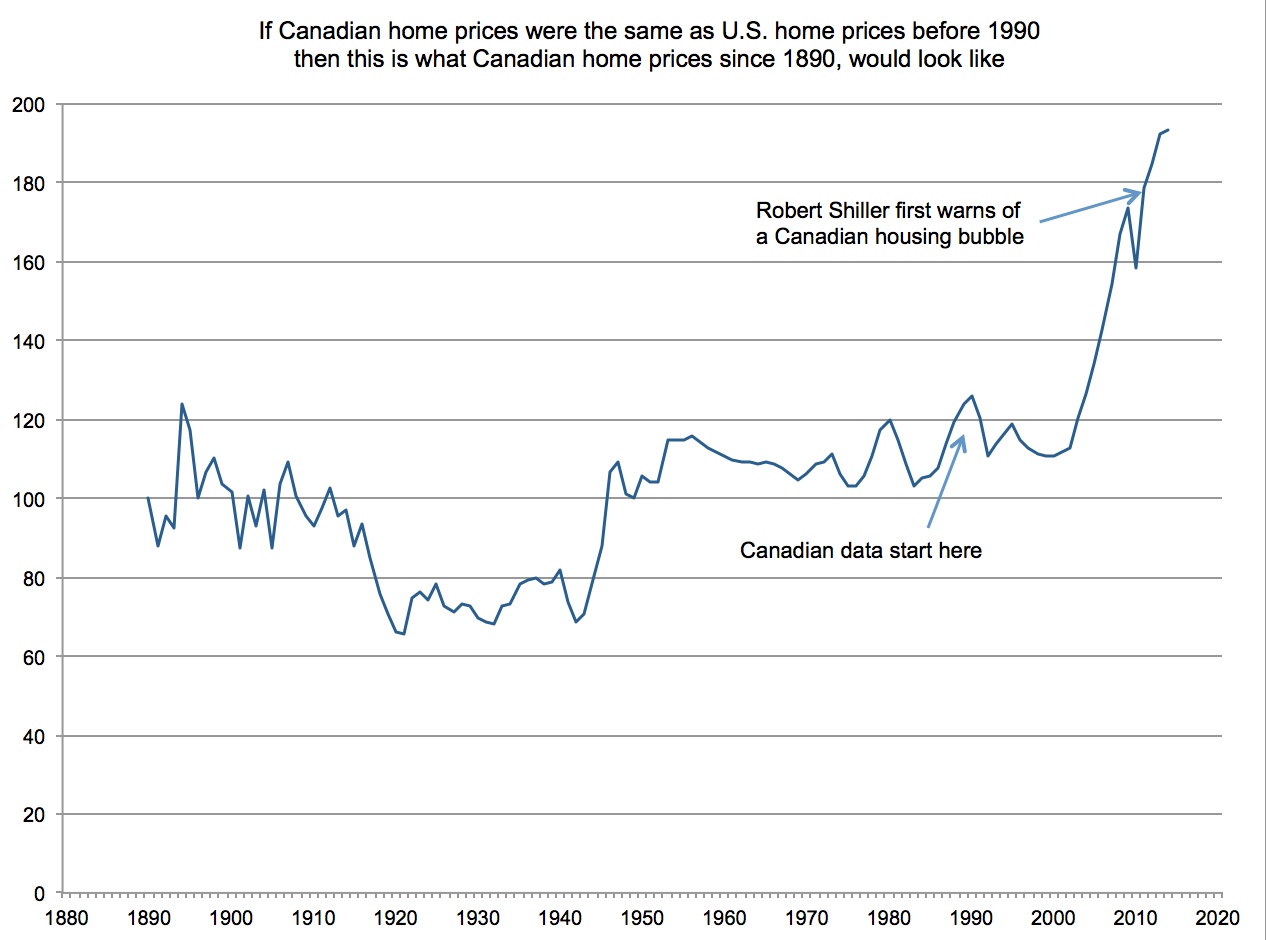
A few hours later he emailed me a chart he’d whipped together, splicing 20 years of Canadian inflation-adjusted house prices onto his data for the U.S. housing market going back to 1890. It was an “experiment” he said. And while far from iron clad (it assumed Canadian prices behaved generally similar to U.S. prices before 1990, and the early Canadian data was based on a limited number of housing markets) the resulting chart served to show how unusual this housing boom has been in comparison to booms in the U.S. before 1990. That original chart can be found here. I keep a copy of it printed on my cubicle wall.
Here’s an updated version that builds on the data Shiller sent me, up to January 2014.
For comparison, here’s the trajectory of America’s housing market over the same period, using newly-updated figures from Shiller’s site:
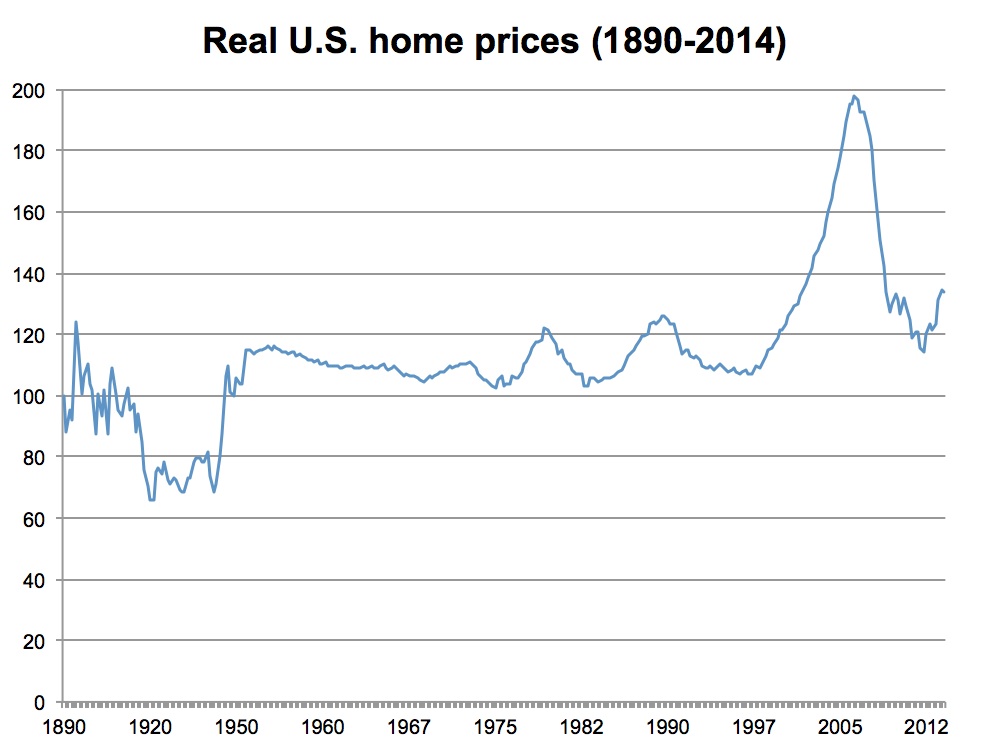
Note that Canada is getting awfully close to the level at which America’s housing bubble topped out at in 2006. Whether compared to past booms and busts, or the most recent U.S. bubble, Canadian real estate prices look dangerously elevated.
*But maybe this time is different.*
UPDATE
@BenRabidoux of North Cove Advisors sends along this index chart which shows the real (inflation-adjusted) price of homes in Canada going back to 1956, so not using U.S. data prior to 1990. (Note: It reflects average house prices, not paired sales like the Case-Shiller and Teranet-National Bank indices.)
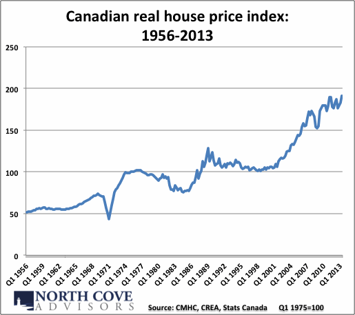
A couple thoughts for the bulls and the bears.
For the bulls: From 1956 to 1974, a period of 15 years, the index doubled in value. So with that in mind, the near-doubling in the index since 1998, 15 years ago, doesn’t necessarily look all that egregious.
For the bears: The index flat-lined for more than two decades after that. But when that happened, Canadian households were far less indebted than they are today, and the Canadian economy did not rely nearly so much on the finance, real estate and construction sectors for growth. A 25 year stagnation in house prices now would be very bad indeed.