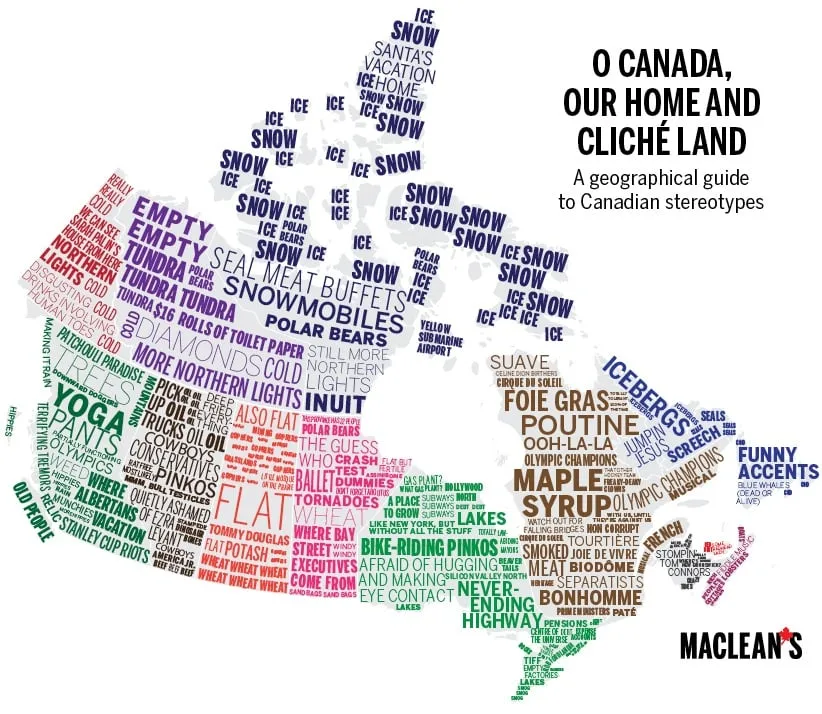
22 maps of Canada as you’ve never seen it before
For a different perspective on Canada, Maclean’s went to the maps. Drawing on a variety of sources, from government statistics to various online databases to tweets, here are some maps to illustrate Canada as you’ve never seen it before.
RELATED:Stunning images of Canada from aboveMapping Canada: View our full map series Travelling to the geographical centre of Canada
It’s been said many times that hockey is Canada’s religion. Inspired by this, we asked FullDuplex.ca to do some data-crunching. Drawing on a year of tweets geotagged to specific cities, they tracked the number of references to "church" and "hockey," and we compared them to see where people tweeted the most about one over the other. (Cities where there was a balance between the two topics aren’t shown.) It’s by no means scientific, but the results make sense. A core of hockey tweeters exists in Vancouver surrounded by B.C.’s Bible belt and, after the Canadiens’ Stanley Cup run, Montreal had one thing on its mind. As for church-tweeting Leafs fans, well, they have endured a championship drought of Biblical proportions.
For the next map, to find out where Canadians cursed the most, we also asked Full Duplex for assistance. The company analyzed a year of tweets to find in which cities the F-word appeared most frequently. Given its massive population, Toronto, of course, came out on top. But even after factoring in different population sizes, T.O. Twitter users still swore the most. Using Toronto as the base, here’s how the frequency of F-words breaks down across some of Canada’s biggest cities.
It’s always a surprise when people first learn that the very tip of southwestern Ontario is at a lower latitude than parts of California—which got us wondering: How do other parts of the country line up with the rest of the world? Here are the results, using Earthtools.org. Most of the cities on this map, and their global counterparts, lie within less than 50 km of each other, latitudinally speaking, of course. Only Quebec-Ulan Bator and Fort McMurray-Moscow are a full degree apart.
What to say? Canada is a land of contrasts. It also offers up a bounty of clichés.
Related Posts
The only acceptable response to Vladimir Putin

My love for the giant that is Ukraine
Click or tap image to enlarge.
According to a report last year commissioned by Motion Picture Association-Canada, in 2011, the film industry generated $20.4 billion in GDP for the Canadian economy and employed 263,000 people. So yeah, it’s big. Drawing on a list of movies filmed in Canada, and inspired by this, we pulled together a breakdown of genres filmed in Canada’s movie hubs.
Ok, let’s be serious for a second. The recovery since the Great Recession of 2008 has not been even, as shown by this map, which captures the last five years of employment growth. There’s still a lot of red in Ontario, representing cities where there are fewer jobs now than there were in 2009.
When Canadians aren’t talking about hockey (or church), they have weather on their minds. These are the reigning best and worst record titles for each province.
As John Maynard Keynes wrote, "In the long run, we are all dead." And the No. 1 cause of death in Canada is cancer. Number 2 is heart disease. But after those two causes, each province and territory is slightly different, when it comes to ranking their remaining leading causes of death. We’ve highlighted the one that most disproportionately affects each province, compared to Canada as a whole.
Clearly, baby-name maps have become somethingofathing. Here’s ours.
Back to hockey. QuantHockey.com boasts a thorough database of NHL players, where they’re born and their performance. We sifted through the numbers to show which provinces generated the most players last season, and took it a step further to show the average points of players in each province.
Delving into the detailed crime statistics for each of the provinces reveals some odd disparities. Below, we picked one type of crime for each province that was at least double the national average. As always, there are caveats: Some high numbers could be an anomaly for 2012, the most recent year for which comparable data is available, perhaps because of a police crackdown; other categories are small, so a coincidental event—or two or three—can skew the numbers. Regardless, they offer a peek at how certain crimes are disproportionately worse, depending on the province.
Canadians are fast catching up to our American neighbours, when it comes to our ever-expanding waistlines, but some areas are bulging faster than others.
Here’s a different way to look at Canada’s population. The circles represent the relative population density of each province. And yes, we know people do live in the Northwest Territories and Nunavut, but there are so few of them, and their geographies so vast, that you’d have to go a couple of decimal places before they’d register.
There’s a lot of focus at the moment on incomes and inequality. We wanted to see where Canada’s wealthiest households live, so we asked Environics Analytics to drawn on its CensusPlus database for the answer. This map shows those census regions where at least 30 per cent of households took home $150,000 in 2011.
The flip-side of the wealthiest households map, of course, are those on the other end of the spectrum. This map shows those places where at least half of all households earned less than $40,000 in 2011. You’ll notice there’s considerably more coloured areas on this map than the one above.
Ever felt like there are more women than men where you live, or vice versa? You may be right. Canada’s distribution of males to females is anything but even.
In 2011 there were close to 6,000 centenarians living in Canada. Here they all are.
While we’re on the topic of age, here are those parts of the country that skew oldest (red) and youngest (green.) Another name for this map could have been Canada’s young north.
#cdnpoli is a hub for political chatter on Twitter for elected officials and enthusiasts alike. But which Canadian cities are the most vocal when it comes to poli-tweeting?
Which Canadian political leader boasts the highest number of Twitter followers, by province? With the help of FullDuplex.ca, we crunch the numbers.
What kind of footprint would Canada’s cities occupy if the entire country moved in? Factoring in the current density of Canada’s major cities, we consider how large they’d be if our entire population relocated there.
Related:
Stunning aerial images of Canada
P.K. Subban on what it means to live the Canadian dream
18 reasons why it’s great to be Canadian
The Canada Day Quiz, Pt. 1: You vs Canada’s Smartest Person!
Mapping Canada: View our full map series
Our partners:writing essay companydissertation writing serviceuk custom essays
Related Posts

A glaring omission from Trudeau’s letters to his ministers: hunger

Why sanctions over the Ukraine invasion won’t stop Putin

The Age of Wildfires

The Coutts blockade and controlling the narrative
Get the Best of Maclean’s straight to your inbox.
Sign up for news, commentary and analysis. Join 60,000+ Canadian readers.