The Canadian flag: a cool ’60s design turns 50
But would we do it as well today?
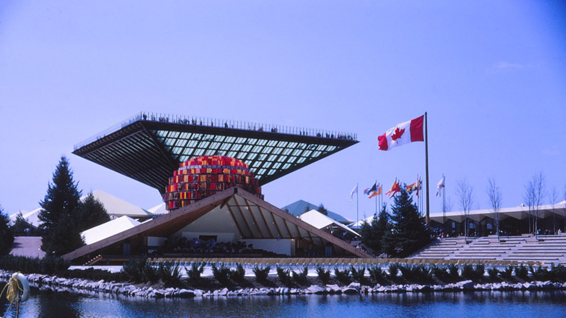
Le pavillon du Canada et sa pyramide inversée, le Katimavik ( signifiant “lieu de rencontre” en langue Inuit). Expo 67, Montréal, Québec, Canada, 1967.
Share
The story of the creation of the Canadian flag, which was officially flown for the first time over Parliament Hill 50 years ago on Feb. 15, is usually told in terms of political wrangling.
On this milestone anniversary, count on the tale being thoroughly hashed over again—how Lester B. Pearson’s Liberals succeeded in pushing through the flag Canadians have come to love against passionate opposition from John Diefenbaker’s Conservatives.
It’s a great yarn. But when I gaze up at the flag these days, I’m not inclined to revisit that old clash between Tory reverence for British heritage and Liberal insistence on a distinct Canadian identity. I’m more prone think about, for instance, the Contempra phone.
You remember the Contempra. Introduced in 1967, Canada’s centennial year, the sleek phone dreamed up and made here in Canada was sold around the world for two decades. It was the signature success in an extraordinary period of Canadian design creativity.
Or perhaps one of two signature successes. The flag exemplifies much the same modern design ethos as the Contempra—simple and symmetrical, bright and bold. And these shared virtues are no accident.
Of course, the maple leaf’s history as a Canadian emblem starts long before the sixties. Rich Archbold’s book A Flag for Canada traces, with engrossing illustrations, how the leaf, especially emblazoned on military and athletic uniforms, had taken hold by early in the last century. But those older leaves tended to look rather realistic. The stylized one on our flag is, as we would now say, pure mid-century modern.
The idea of a flag featuring a single leaf between red bars was first proposed by George Stanley, then dean of arts at the Royal Military College of Canada in Kingston, Ont. Stanley’s concept was accepted, after bitter debate, by a House committee on Oct. 22, 1964. Only after that political choice was made, though, was the fine work on how the flag would ultimately look taken up in earnest.
Pearson assigned Ontario MP John Matheson to spearhead the project. Matheson turned to Patrick Reid, who was then heading the federal government’s exhibition commission, for expertise. The commission’s top-flight graphics section, which executed everything from trade-show displays to world’s fair pavilions, made it the logical choice. Reid called in his best designer, Jacques St-Cyr.
And so it came about that Matheson, Reid and St-Cyr worked long into an early November night back in 1964, devising our flag’s finished graphic scheme. Of the three men, Reid, now 90 and living in Vancouver, is the last one living, and he gives St-Cyr full credit for the final product (as I reported in this earlier story).
Strangely, St-Cyr rates at best a passing mention in most accounts of the flag’s creation. He grew up in Trois-Rivières, Que., served in Europe during the Second World War, then studied design in New York before coming to work for the government. Over a long career, he rose to senior posts in Ottawa, including heading design for federal museums.
Although his death in 1996 drew scant notice, St-Cyr is remembered warmly by old colleagues. Michel St-Jean, who was a top federal museum designer before moving on to a notable career in retail-store design, started out under St-Cyr in 1969. In an interview from Peterborough, Ont., St-Jean told me St-Cyr was a sensitive mentor, with an intellectual streak, as evidenced by the extensive book collection in the Ottawa apartment where he often cooked fine meals for friends.
Sometimes over dinner they discussed their craft. “I remember Jacques saying, ‘We’ve got to simplify everything—everything should be clear, concise, well-balanced, readable’,” St-Jean said. “I think the whole flag came out of that, especially the leaf. He was very much a product of that European simplification that came out after the war.”
Don McGregor, who also worked for the exhibition commission, met St-Cyr in the late sixties, when they were both attached to what was called the National Design Council. McGregor remembers how the modernist verve of designers like St-Cyr burst into the consciousness of Canadians with Expo 67 in Montreal. And Expo, McGregor notes, was deeply and directly influenced by what was happening in European design, particularly in Switzerland.
“Jacques was one of those guys who was very aware of all the trends in design,” he says. “What we ended up with is one of the most recognizable flags in the world. I mean, it’s so simple. And that’s what was inherent in that new sense of design that was coming into Canada at the time.”
Back in 2005, the Canadian Museum of Civilization (now the Canadian Museum of History) put on a show called Cool ’60s Design, in which curator Alan Elder succeeded in capturing the way objects from the era managed to somehow combine discipline and delight.
By that, I mean the way a Contempra felt fun while also being eminently functional. Expo delivered that potent combination again and again. Odd chairs turned out to be comfortable. Groovy bubble phone booths kept the rain off. Paul Arthur’s pictograph signage was cool but clear. Our flag is like that. St-Cyr insisted that it be instantly “readable” at a distance, not blurry. Yet the effect isn’t just efficient in signifying “Canada”—it’s beautiful.
I wonder if we would do it so well today. In need of a logo for the 150th anniversary of Confederation in 2017, the federal government has staged a contest, open to all Canadian citizens. Populist, I guess, but will it deliver the best possible image? The recent controversy over the government’s planned Monument to the Victims of Communism near Parliament Hill involves the expert advice of the country’s top urban designers being flatly ignored.
Our flag was the product of several currents. History turned the maple leaf into our emblem. Politics put it on a flag of our own. But design made that flag excellent. We should remember, on Feb. 15, that it wasn’t an accident.