On Campus grades six university apps
One school gets an A-grade. Another failed the assignment.
Share

Universities in Canada are rushing to get their apps onto your phones and tablets. When done right, those apps can help potential students see into the soul of a campus. Even better, they can help current students find their way to lunch, to class and to enriching events. But when done poorly, apps can make a school look out totally of touch with technology. The lesson? Don’t rush your app schools. Here’s what we think of six Canadian universities’ apps for iPhone.
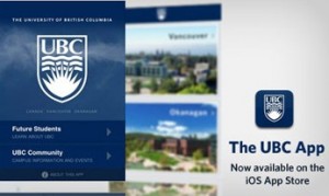
University of British Columbia — Grade: A
If every school made an app this good, then there would be no more paper brochures arriving in the mailbox, no one will ever get lost on campus, and no student would ever have an excuse to say that they’re bored.
Click on “Future Students” and then on “Videos.” Unlike most promos, these videos have compelling stories. Watch the Faculty of Arts video that follows a team of students on their journey across Mongolia on motorcycles. It’s an example of the type of interdisciplinary project that UBC professors encourage.
But that’s just the beginning. There are also useful features for current students. For example, the events calendar shows students what’s happening on campus that day. They can decide between an art show on Japanese-inspired Inuit art, an intro lecture on Life Cycle Analysis and a documentary movie at the Student Union Building — all with prices, times, and directions right there on one page.
University of Saskatchewan — Grade: B
Saskatchewan understood the assignment well. They also get points for having been the first brave school in Canada to go mobile. Even though it’s aging, the app still does all the things students would normally do on a university website, but now they can do it from the bus, the cafeteria or the line at the student aid office.
On the front page, there’s access to e-mail, final exams info, The Sheaf student newspaper, a grade tracker and a class schedule. All of it is easy to use. The only things missing are transit information and good photos of campus. Those Webcam shots are dated. (They’re soooo 2005.)
University of Western Ontario — Grade: C
UWO has always had a cumbersome website and their app suffers from the same affliction. The front page includes icons entitled Giving Back, Faculties and Sessional Dates. (What exactly is a “sessional date”? Anyone?) It’s unfortunate, considering that there is good information here. It’s just buried under those nonsensical titles. For example, click on “Faculties” and then “Ivey School of Business.” You’ll find Quick Facts about the school and the programs they offer. It’s a virtual viewbook — they just didn’t tell you that.
University of Alberta — Grade: C
There are some features here that are useful for a user on the go, such as a map with icons attached to buildings and a description of what’s inside. “Pizza, anyone? My phone says there’s some in that building over there!”
Elsewhere, the app fails at useability. For example, the calendar requires so much scrolling through listings like “students in Phase II of BSc in medicine must…. blah, blah, blah,” that it’s not remotely useful. Similarly, the transit tool was a good idea, but it was poorly executed. It looks like nothing more than a long list of light-rail stations and the times that trains have already left.
York University — Grade: D
This app looks slick, but the content is boring. Sorry York, but few students are going to click on headlines like “York in the news” or “Guidance Counsellors Assemble!” On top of that, the photo gallery screams “someone in the meeting thought this was a good idea.” It wasn’t. A more useful application of those photos would be a tour around campus. Let’s hope that version 2.0 is better.
McMaster University — Grade: F
The screen at the beginning says “loading” for so long that suspense builds and builds. But it’s not worth the wait. Inside, users are asked to choose between “Thinking about MAC” or “Current Students.” Clicking on “Thinking about MAC” presents two confusing options: “Residence” or “Faculty of Science.” Clicking either prompts an error message. Clicking on “Current Students” at the opening page doesn’t lead to anywhere better. I choose “Second Year,” then “Faculty of Science,” then “Kinesiology.” Those multiple clicks are rewarded by nothing more than a reminder that my OSAP application was due in January. Let’s hope that version 2.0 is built from the ground up. There’s no saving this one.