Mapped: Another way to look at job growth
Edmonton leads the way on map that shows five years of economic recovery
Share
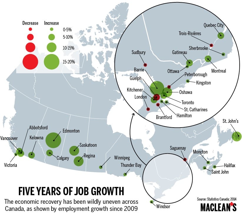
The recovery since the Great Recession of 2008 has not been even, as shown by this map, which captures the last five years of employment growth. There’s still a lot of red in Ontario, representing cities where there are fewer jobs now than there were in 2009.
More from our series, Mapping Canada:
Hollywood North by genre
Canada’s most popular baby names by province
The skinny on fat in Canada