Dr. David Williams is called out—and Doug Ford doubles down on him
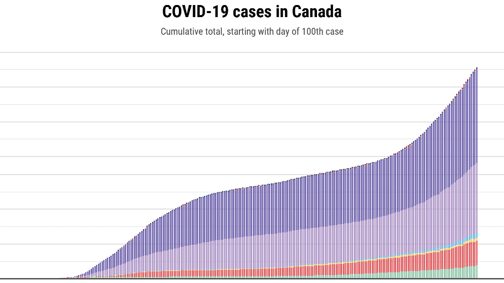
Note: Data in the charts last updated on Nov. 27 at 7 a.m. EDT. (Some provinces include their weekend numbers in Monday’s data announcement.)
Dr. David Williams, Ontario’s chief medical officer of health, “did not lead Ontario’s response to COVID-19,” says the province’s auditor general. Instead, in a scathing report, Bonnie Lysyk states that politicians, led by Premier Doug Ford, drove the province’s actions. The result, Lysyk writes, were plans and reactions to the crisis that were “slower and more reactive” than other provinces.
The three-volume report has raised concerns—and reinforced some existing ones—about leadership as Canada’s most populous province struggles to contain a second wave of the pandemic. Ontario’s response was shaky and unwieldy from the beginning, it suggests. A Health Command Table, established in late February to give advice to the premier and cabinet, originally had 21 members. Then, as the first wave intensified, more and more tables were created, and the organizational structure of the province’s response to the pandemic “evolved to become cumbersome, with numerous participants at multiple tables and sub-tables,” says the auditor general in her report. By November, that Health Command Table had more than 500 participants.
Though Premier Ford frequently said in public statements that he was deferring to the expertise and advice of Dr. David Williams and other public health experts, the auditor general stresses that Ford and his Progressive Conservative colleagues were actually making the judgment calls. “The ultimate decision-making power for responding to COVID‑19 (such as the approval of new expenditure for specific COVID‑19 initiatives) lay with the premier and the cabinet,” her report says.
That meant the province made some decisions that “ran contrary to expert advice,” the report says. On the Thursday before March break, for instance, Ford told families to go ahead with their vacation plans even though health experts in Canada and around the world were warning against travel. The next day, Williams urged Ontarians to avoid non-essential travel.
Related Posts

Canada’s Flu Seasons Are About to Get a Lot Worse

A Doctor’s Plea for Civil Discourse
In another example, the Health Command Table had been presented on May 19 with analysis and evidence “showing the limited value of asymptomatic testing where no known COVID‑19 exposure exists,” Lysyk’s report says. Yet five days later, the AG report notes, the Ford government announced that anyone could be tested for COVID-19, whether they had symptoms or not, “using laboratory resources and slowing how quickly symptomatic individuals could be tested.”
The government also released a new colour-coded system in early November for ranking the COVID-19 situation in public health regions that the auditor general found “did not contain all the recommended indicators and was generally more lax” than what public health experts suggested.
Health Minister Christine Elliott pushed back on the report, calling it a “mischaracterization” of the government’s pandemic response, saying: "We have been decisive at every turn.” (In rebuttal, Lysyk said that her report had been fact-checked and sent to all the stakeholders for comment, who signed off on her findings.)
Less than two hours later, Doug Ford attacked both Lysyk and her findings, saying: “I have some serious, serious problems with this report. To say that Dr. Williams wasn’t leading this effort isn’t right, in fact it’s wrong.
“For the auditor general to undermine [public health units and experts, including Williams] right now, I have to question that,” the premier said, before itemizing the five provinces who currently have higher infection rates than Ontario’s. Ford went on to accuse Lysyk of throwing "hand grenades” into the response and recovery effort, remarking acidly that he didn’t want “an accountant who starts giving me health advice.”
[tweet id="1331676294787059715" url="https://twitter.com/drmwarner/status/1331676294787059715?ref_src=twsrc%5Etfw"]
Williams, himself, avoided direct response to Lysyk’s report in the short press conference, talking instead of the complex nature of the province’s response and saying there was "light at the end of the tunnel." But a spokesperson at the Ministry of Health responded to Maclean’s request for a comment from Dr. Williams with a statement saying he "has led, and continues to lead, this province’s public health response," adding:
This includes providing recommendations that have been essential to government actions and plans, including the Safe Reopening of Schools Plan and the COVID-19 Response Framework: Keeping Ontario Safe and Open. Dr. Williams has been one of the Command Table’s functional co-chairs since its inception, ensuring the government receives the vital advice it needs to fight this virus.
Whatever the current caseloads in other provinces, Lysyk drew sharp distinctions between their responses throughout the pandemic and Ontario’s. Unlike other jurisdictions, such as British Columbia, where Dr. Bonnie Henry “made decisions throughout the pandemic,” Lysyk said at a press conference on Wednesday, Ontario had an “advisory process” for its own chief medical officer.
“He worked with the system that was there,” said Lysyk. Not only was Williams not a member of the powerful “Central Coordination Table” (though he attended meetings when required), his role was reduced further in August when the Emergency Operations Centre was removed from his portfolio, her report noted.
The auditor general singles out Williams for withering criticism, writing, “The chief medical officer of health did not fully exercise his powers under the Health Protection and Promotion Act to respond to COVID‑19;” in particular, the report said, “he did not issue directives to local medical officers of health to ensure public health units responded consistently to the COVID‑19 pandemic, nor did he issue directives on their behalf.”
The result of William’s lack of action, Lysyk found, was a jumble of local and provincial directives that confused the public. In particular, the auditor general criticizes his lack of leadership when it came to issuing a mask mandate. As local public health units issued their own orders, the report says, Williams did nothing to ensure the mandates were consistent. Finally, in October, a provincial mask mandate was issued, though by the government, not Williams.
Williams’s lack of timely response may have proved deadly, the auditor general’s report reveals. On March 18, the day the first outbreak was reported at a long-term care facility, Williams got an email from a senior officer at an unnamed public health unit asking him to require “long-term-care home workers to wear masks at all times while in the facility.”
However, the report reveals, “no immediate province-wide action was taken...A directive requiring all long-term-care home workers to wear masks throughout their entire work shifts was not issued until April 8.” By then, the report notes, 69 facilities had outbreaks, involving 857 cases and 88 deaths, which accounted for 44 per cent of all COVID-19 deaths in the province to date.
Nor did the chief medical officer of health issue an order to protect foreign farm workers, who proved particularly vulnerable to outbreaks due to crowded living and working conditions. Instead, eight weeks after the first farm outbreak, he issued a memo recommending local health units act to reduce transmission.
The sharp criticisms of Williams came a day after Christine Elliott asked the legislature to extend his tenure. “Now more than ever, we need experienced, stable leadership," her motion stated, adding: "Dr. Williams has been at the forefront of our province’s response and has worked day and night to keep Ontarians safe and informed.”
The decision to re-up Williams was criticized by many health experts including Doris Grinspun, head of the Registered Nurses’ Association of Ontario, who said she was “speechless” at the announcement, telling the Globe and Mail: “We did not take advantage of the summer with low number of cases to suffocate this virus, and every single turn we have done things slower than we should.”
Though the government wanted Williams’s extension to be approved on Tuesday through a unanimous vote in the legislature—and was even prepared to have the chamber sit until 3 a.m, their fast-track plan —the plan was scuttled by opposition politicians who denied the government their endorsement. It will now have to go through a normal debate and a vote.
The chief public health officer wasn’t alone in being sidelined, Lysyk’s report says. Public Health Ontario, which was created after the SARS pandemic in 2003 to provide expertise during health emergencies, also “played a diminished role” with some of its tasks given to another agency. As well, “some Health Command Table members informed us that Public Health Ontario’s expertise was not always sought, including on testing of all visitors to long-term-care homes for COVID‑19,” the report says.
And the auditor general extends her criticism beyond the decisions of the current Conservative government. The province’s ability to react to a long-term evolving public health crisis was seriously undermined by years of neglect of planning for such crises by successive Liberal and Conservative governments: “The Pandemic Response Plan has not been updated since 2006. In addition, the Ministry of Health has two plans that are relevant for COVID‑19, and these plans have not been updated since 2013. As a result, many of the roles, responsibilities and practices were outdated.”
Reports and recommendations issued after the deadly SARS pandemic in 2003, which hit Ontario particularly hard, were ignored. And the existing emergency response plans hadn’t been tested in years. Moreover, Public Health Ontario’s budget has been cut so many times that, in 2017, it warned it might be unable to respond to potential public health threats. And in last year’s budget, the Ford government announced large cuts to its transfers to public health units; Toronto estimated those reductions would leave a $1 billion gap over 10 years.
Instead of using existing plans after the province declared an emergency on March 17, the auditor general says, the government “responded to the crisis by hiring an external consultant to create a new structure,” which didn’t take effect until April 11. That new plan by McKinsey & Co., which cost $1.6 million, wasn’t finalized until the end of April. The result, according to Lysyk’s report, was that the “command structure also was not dominated by appropriate expertise (key public health officials did not have the top leadership roles and did not fully exercise their powers),” and “those with public health expertise did not play a leading role” in the Ministry of Health’s response to the pandemic.
Now, as the fallout of the report reverberates through the halls of power, Ontario struggles to cope with a second wave of the pandemic. In the past week, the province has added an average of 1,407 new cases each day, while another 137 Ontarians have died of COVID-19.
Related Posts

Canada Needs a National Vaccination Registry

The Secret Weapon in Canada’s Sewers

The Smart Case for Private Health Care

AI Could Save Canada’s Health-Care System
Get the Best of Maclean’s straight to your inbox.
Sign up for news, commentary and analysis. Join 60,000+ Canadian readers.